

Overview
The Roost grew from a basic idea-speculative design.
According to Dunne & Raby, "This form of design thrives on imagination and aims to open up new perspectives on what are sometimes called wicked problems, to create spaces for discussion and debate about alternative ways of being, and to inspire and encourage people's imaginations to flow freely. Design speculations can act as a catalyst for collectively redefining our relationship to reality."
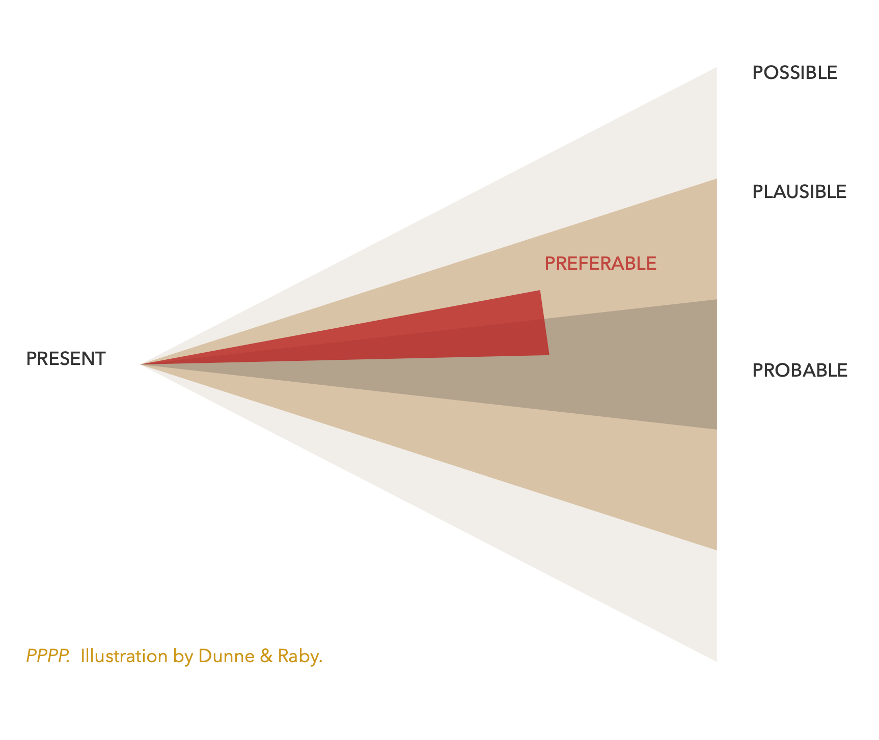
For this concept development project, I used a method Dunne & Raby call PPPP (Probable, plausible, possible/preferable). It operates in the scope of possible futures, not fantasy, and allows the imagination to explore potential solutions before that problem becomes a reality.
Possible Future
Presently few restaurant organizations operate solely from donations, bartering, suspended meals, and volunteer work. The probability that an organization like this becomes necessary in the future depends on various factors. The likeliness would result from an economic collapse and a dependency on local communities. Although it may seem like an abstract idea, both are plausible occurrences. These possibilities are why a model like the one Roost Kitchen & Gallery suggests is worth exploring, experimenting with, and perhaps necessary.
At the very least, it would be preferable to find out if this type of organization could exist under current conditions rather than waiting and making such explorations during trying times.
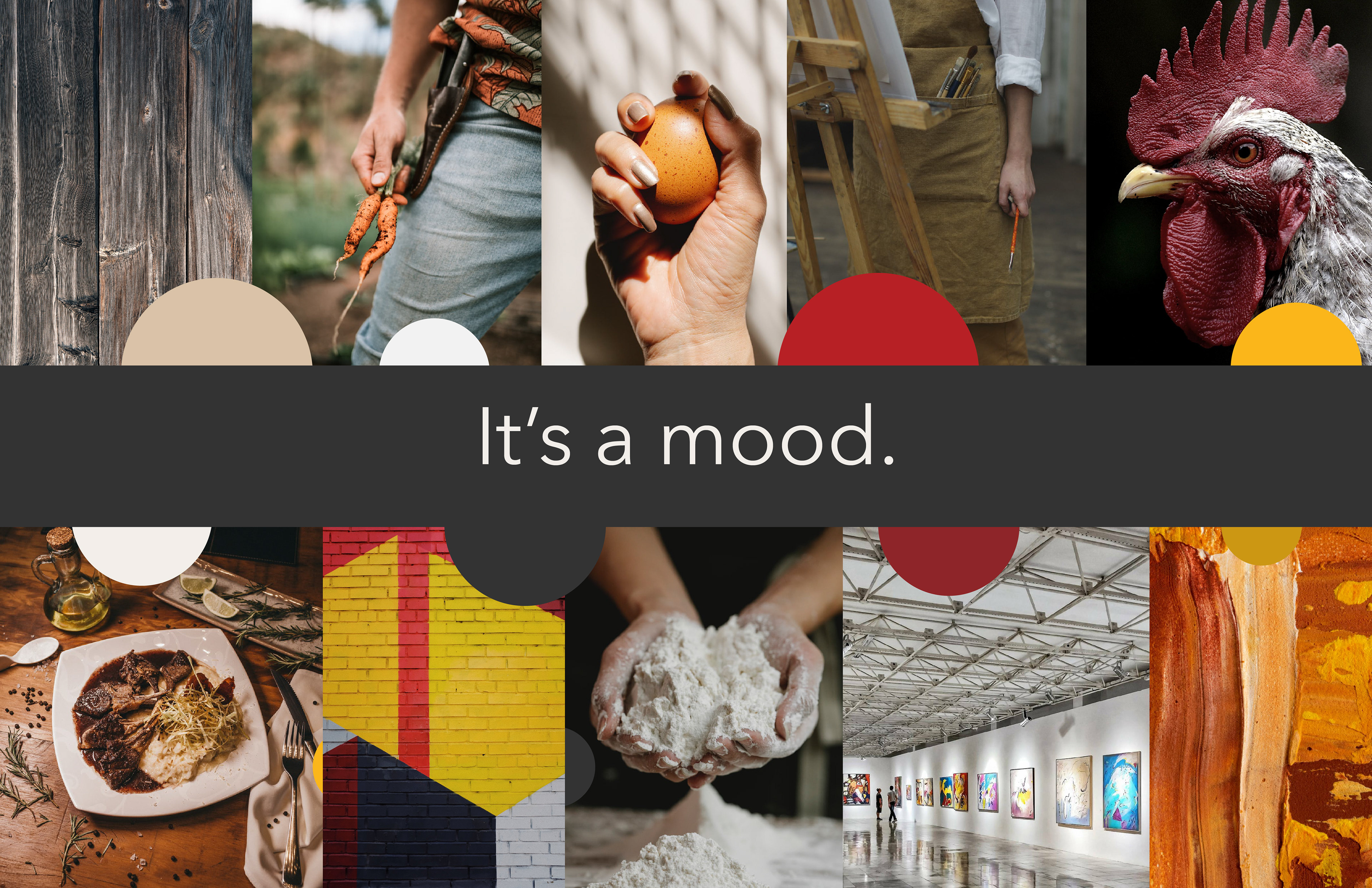
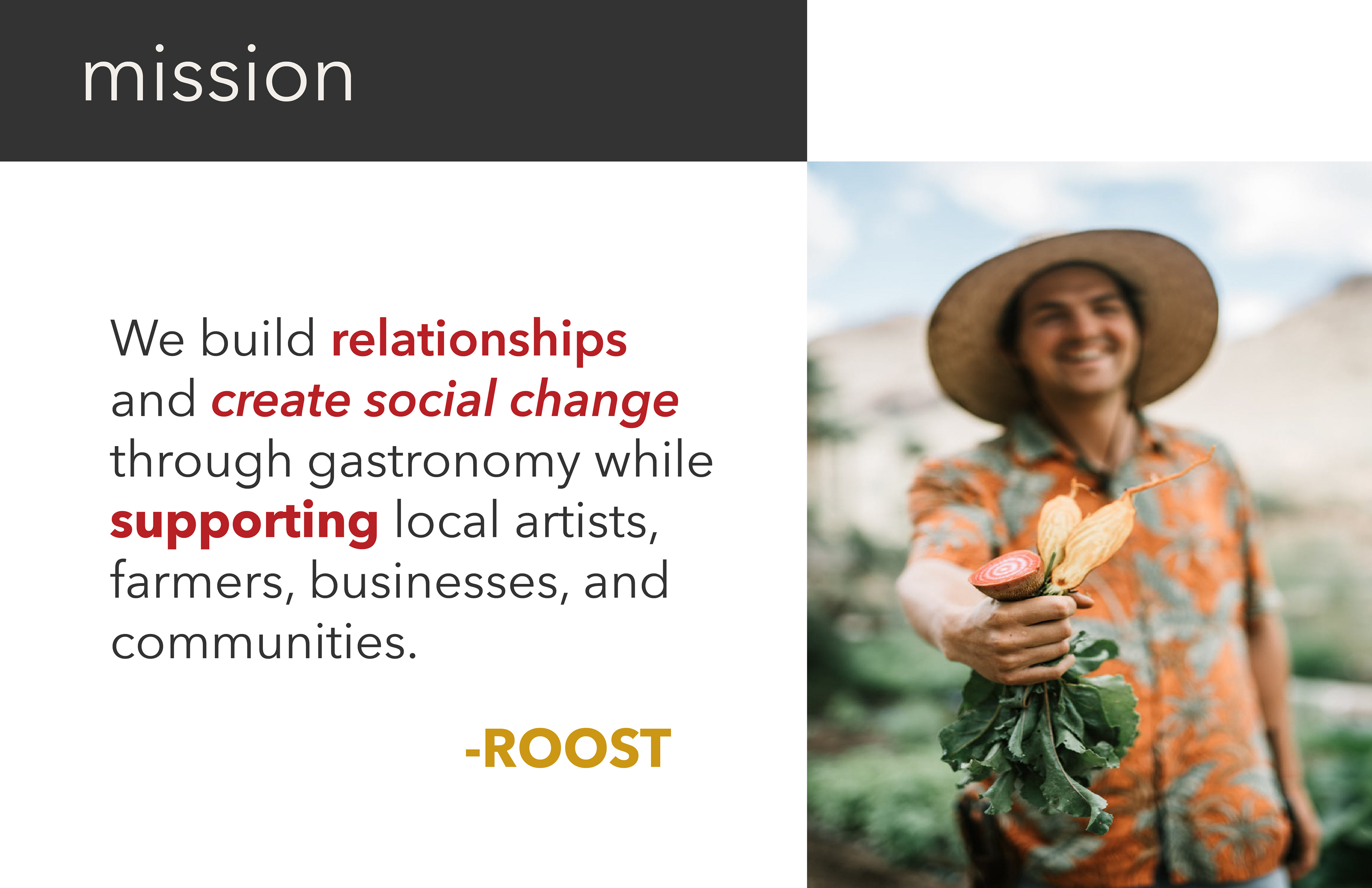
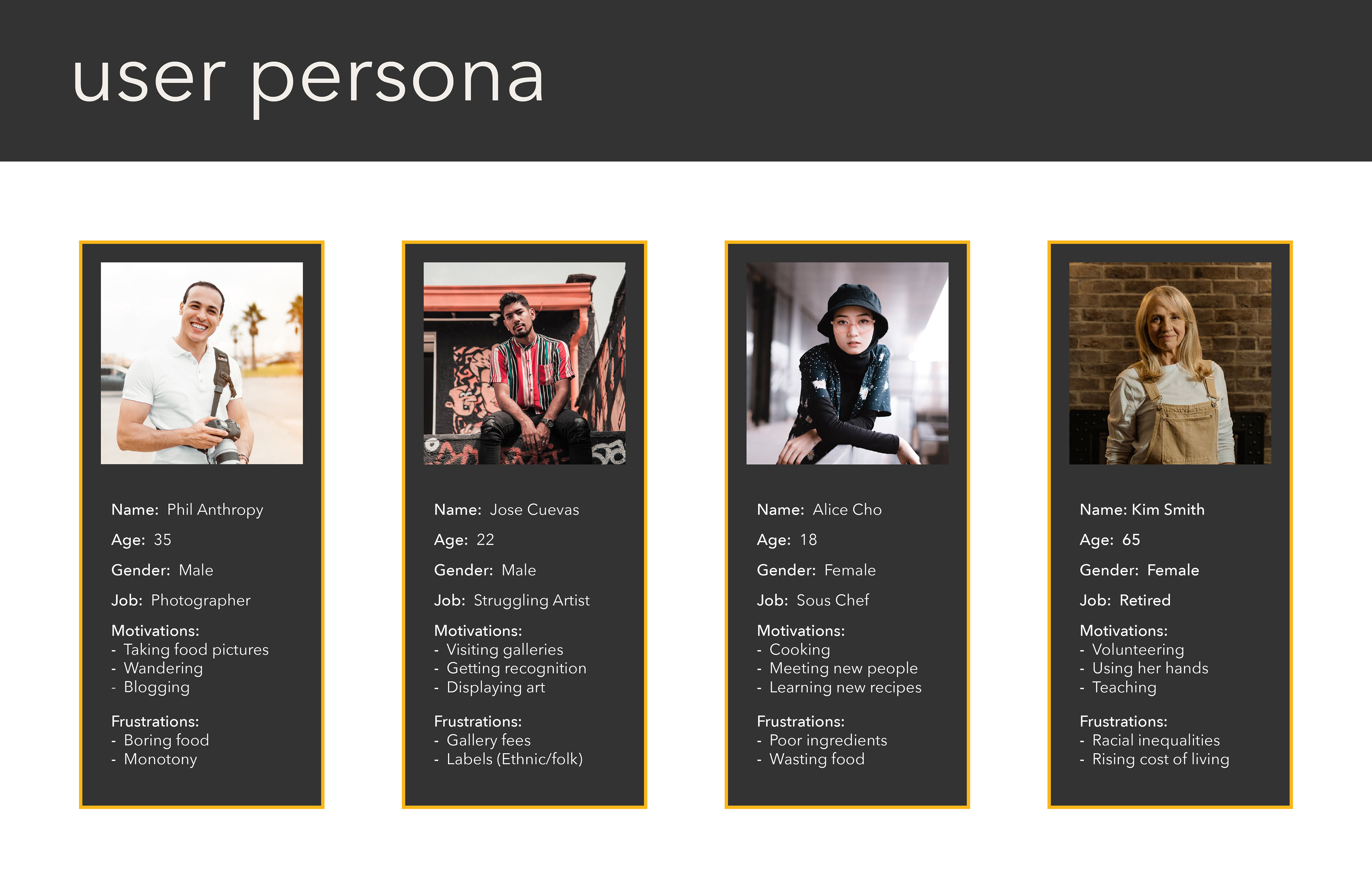
Mood Board, Mission, & User Personas
All design decisions were inspired by this mood board, with the mission in mind, and for the users.
Logo Creation
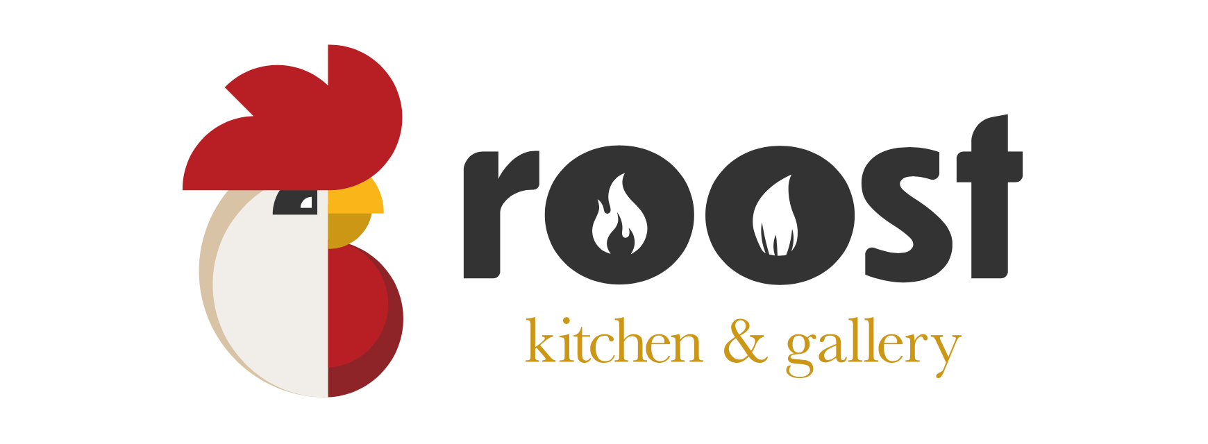
Why a rooster as the logo? The short answer is that it represents the start of something new.
Here is my journey in creating the logo.
I began by studying and sketching as many pictures as possible of roosters from different angles, some close-ups, and some whole bodies. This approach was a good and bad thing. It was good because I could get acquainted with my subject, but it wasn't good because it was too realistic when I began to design the logo. I wasn't pleased with this direction, as it was not reading as a restaurant and gallery logo. It was more of a direct translation of the subject.

Studies.

First round of vectors.
I knew I had to shift gears, go back to the drawing board and go in a new direction. Using these existing logos for inspiration I tried to find commonalities and implement them in the new design. I knew I wanted to use shapes found in art and similar colors that are familiar in restaurants.
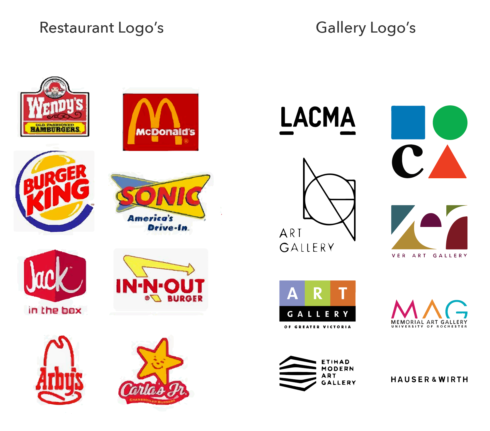
Forcing connections.
Process

Here is a glimpse into the process of creating the new logo using simplified shapes and using the head of the initial logo as a starting point. I explored making very minute changes, color exploration, contrast, various lockup combinations, and type exploration.
FINAL LOCKUP
Prototyping
After creating the logo, it was time to give the idea some life, and I decided to prototype the look and feel of the site's mobile view. This scenario shows how to volunteer at the Roost.
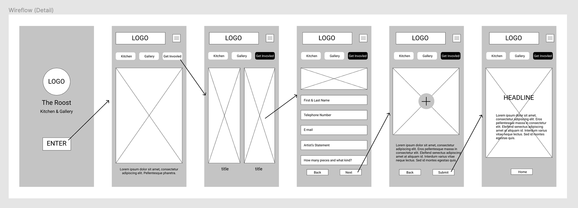
Simplified wire flow and wireframes of the site.
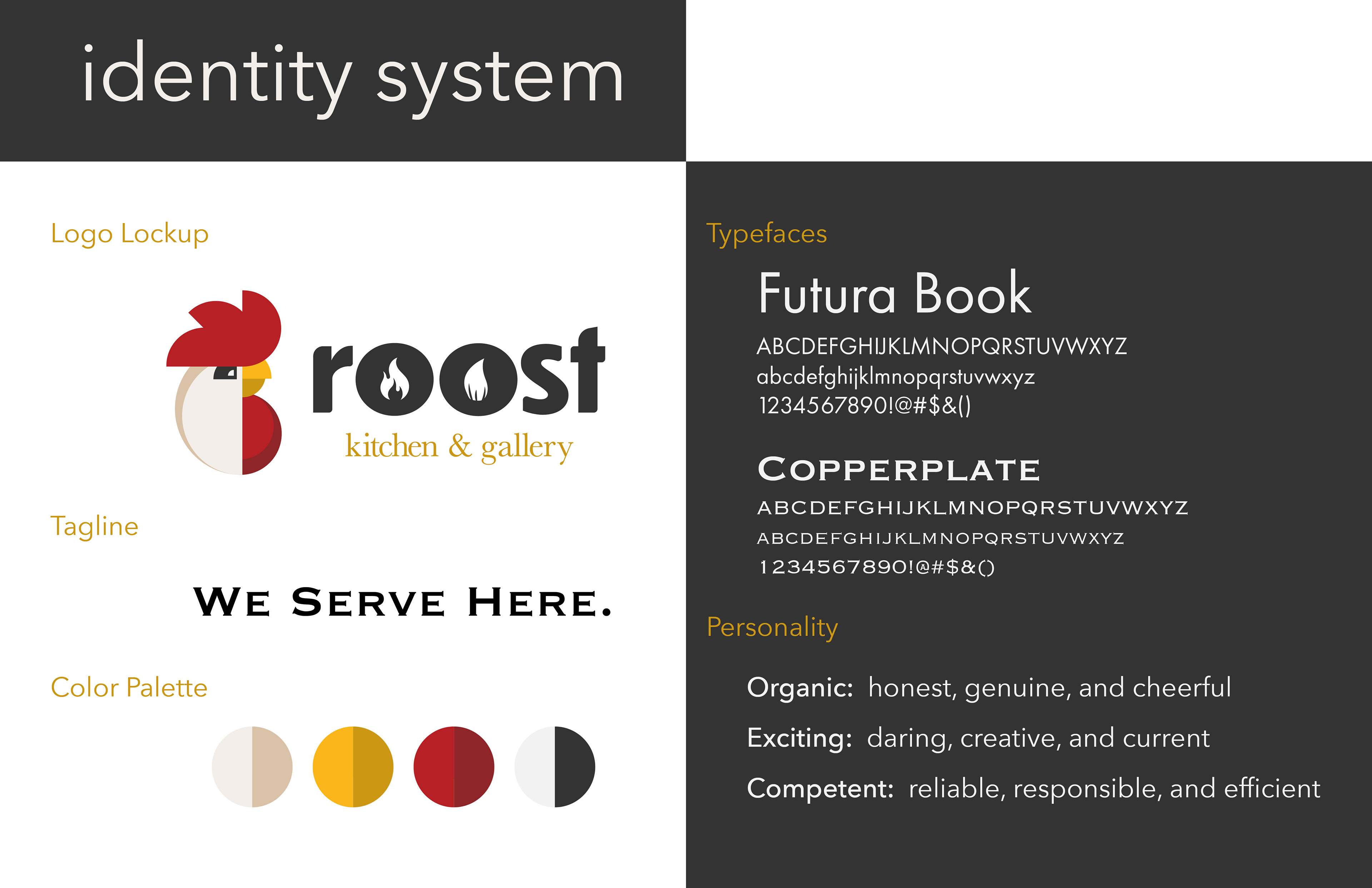
Before implementing details to the site, there was a need to create an identity system to give the site design direction on color, typefaces, and personality.
Scenario Walkthrough
The scenario shows how a user would volunteer as an artist at the Roost and submit art pieces to the gallery space.