OVERVIEW
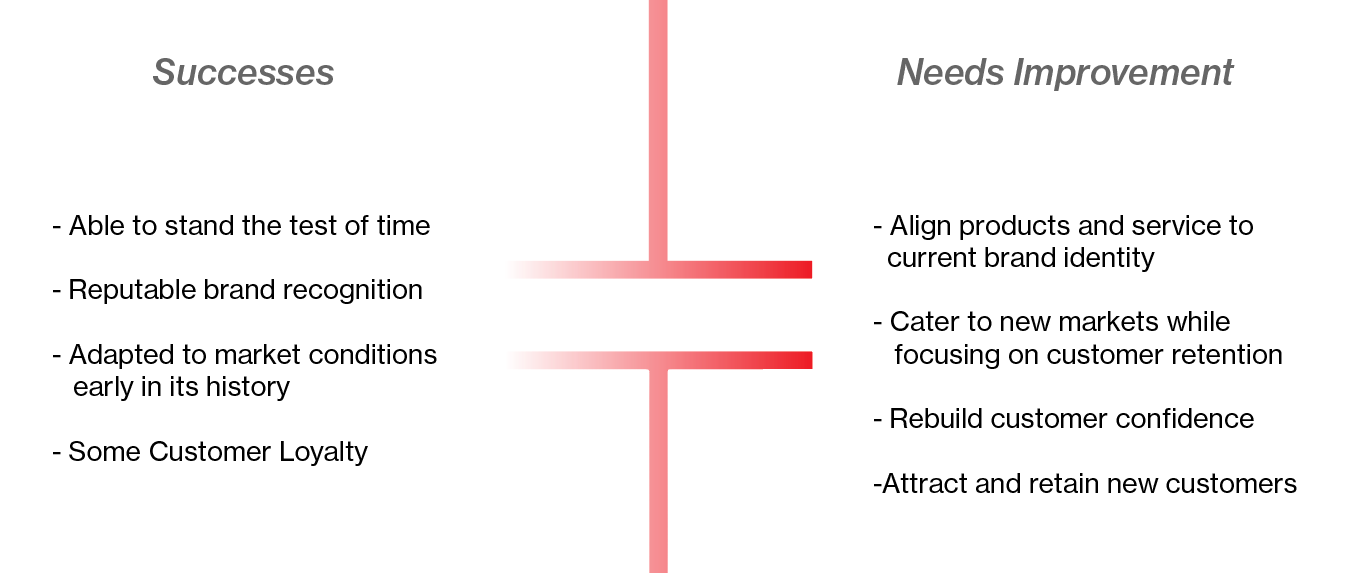
RadioShack Corporation is an American retailer that recently celebrated its 100th anniversary. What originated as a company focused on supplying amateur radio equipment established itself as one of the leading electronics suppliers of the twentieth century.
It achieved this status by catering to the average American hobbyist curious about electronics. For many, it was more than just a trip to a retailer. It was a place where one could go to discover, purchase, and create. It was a place where a staff member was more than just a salesperson. They, too, were knowledgeable, curious problem-solvers. Radioshack was a hub for communication enthusiasts.
But somewhere along the line, the company lost its way. The following is a pitch to convince a rebranding initiative.
Analysis

Demographics

Logo Redesign
I knew I wanted to incorporate some electronic symbol elements when beginning the logo redesign. Both to pay tribute to the old Radioshack, but also to indicate a new direction. Below are some quick sketches I put together to try and understand what could work before moving on to digital comps.
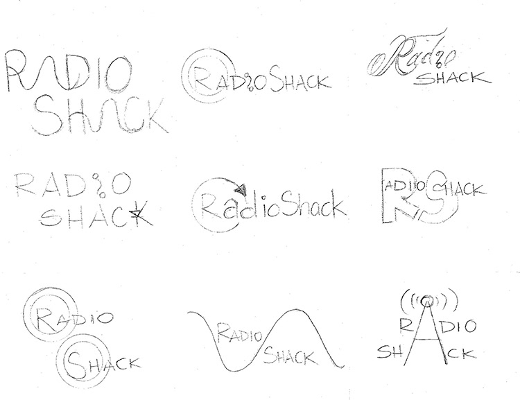

After receiving feedback from my peers, I narrowed it down to three potential designs. The next step was to turn my sketches into vector images using Adobe Illustrator.
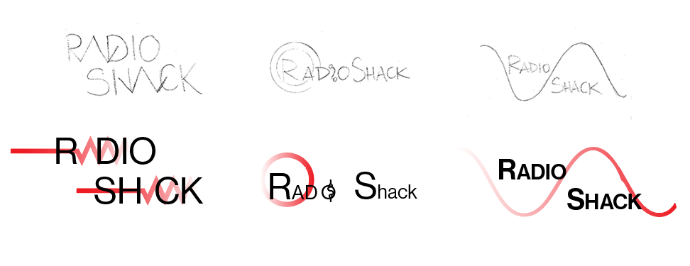

Once I created rough comps of the potential designs. I decided the last design had the most potential. The main reason was the radio wave. Since the company started selling radios, keeping the wave as the main design element only made sense. In addition, all new modern products also work on some form of radio wave. It made perfect sense to move in this direction. But the logo was not quite there yet.
Below is the final version of the new logo.
The new, simplified logo signifies reliability and strength. It also resembles the cell structure of electronics diagrams in how each letter is proportional to the next. The logo incorporates a wavelength connecting the letter H and the letter A, paying homage to the old radio waves and tying into the new product focus of cell phones. The colors have been slightly modified to align with the new brand identity and stay true to the brand's history and reputation. Lastly, the name has been shortened to the shack, so it is not specific to radio and can adjust accordingly to future markets without changing it again.
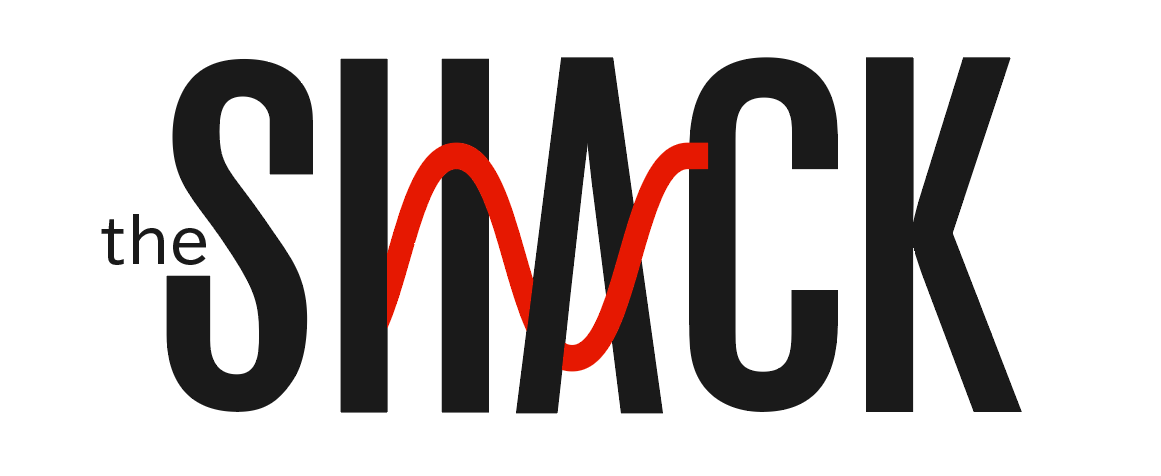
Final logo redesign to be used in all new market collateral.
Art Direction
Core Values
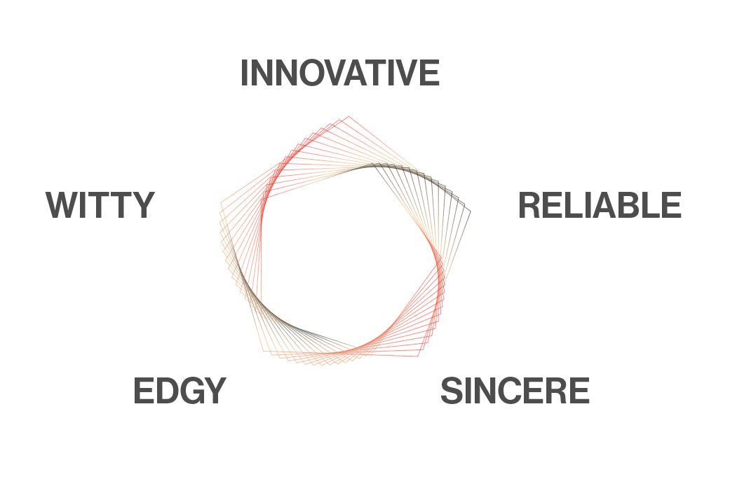
Every new art direction needs a new set of core values. These five core values will help guide all aspects of the new brand identity. It will aid in creating cohesive campaigns, marketing strategies, and design decisions. These values will also serve as a guide to refer back to anytime a design problem arises to ensure all elements are in line with this new direction.
Color Palette
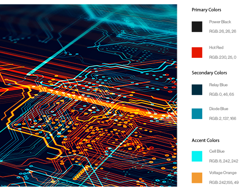
This color palette was inspired by modern technology's inner workings and by paying tribute to the company's traditional colors by keeping consistent with the company's primary colors.
The primary colors will be Power Black and Hot Red. The colors have been modified to create change, but not far enough to stray away from the recognizability of the original branding and logo identity.
The secondary colors will be Relay Blue and Diode Blue to add a modern look and feel to the branding.
These accent colors will be Cell Blue and Voltage Orange; these colors will highlight messaging, typography, and photography.
Photography
The new art direction will include high-quality photography that will stimulate interest in the target audience. This inclination will showcase the user experience of the new product lines and will also highlight the inner workings of the technology as a reminder that we are still very much interested in inviting our customers to play and discover how they work. Finally, the photography will stay true to our new palette and will incorporate similar colors.

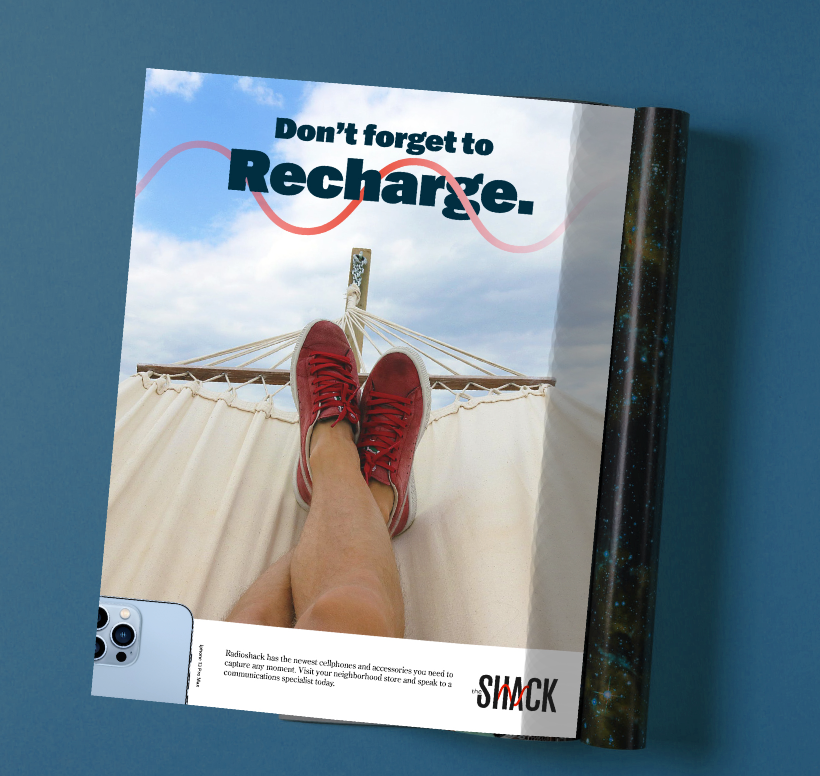
Ad Campaign
The new ad campaign will incorporate high-quality photography, big, bold text with a witty caption using technology metaphors and puns, promote a particular product used to capture the image, and spark the consumer's curiosity. The call to action will always encourage the customer to visit a Radioshack location and have a knowledgeable conversation with their neighborhood specialist, just like the old days.

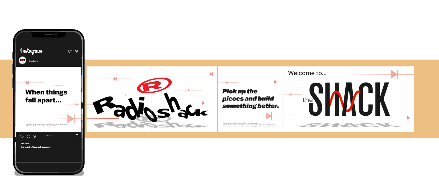
Social Media Carousel
We will create digital content that aligns with our art direction. Instagram posts like these will be playful, use our new typeface, and incorporate color where appropriate. The posts will tell a story.